Nock Co. "Dusty Blue" DotDash Note Cards - Fountain Pen Test

My good friends Brad, Jeff, and the crew over at Nock Co recently released their second colorway of their DotDash Note Cards, Dusty Blue.  Being a "blue" man myself, I was very excited about these.  Not that the orange or "Amber" color doesn't pop, blue really is more of my comfort zone.

The guys were kind enough to send me over a pack of these to try as well as their case called the Fodderstack (which will have it's own review in the future) that holds a pen of choice as well as a little stack of their cards.  Brad eluded to a prototype on the Erasable Podcast this past week of a Fodderstack that holds a Field Notes sized book... such a tease that Dowdy...

With each product I ship I send a little hand written note and I've found myself reaching for these as my go-to recently, so the guys should expect orders from me...  They are small, stiff (80 lb paper), and generally do pretty awesome with all pens so I don't worry so much about what I'm grabbing to write on them with.

For the review I wanted to do a pretty strong comparison of a variety of fountain pen nibs, brands, and inks to see the outcome.  Also, to compare the new colorway to the previous.

I've been due to clean a few fountain pens, but having too many inked up actually made for a great selection to test with.

What I threw at it:

From the list there are a lot of F nibs, but being a good mix of Asia and Europe I felt it a good test group for diversity.

What I found is that with the really wet nibs, the Falcon M nib in particular did not do well and tended to feather terribly, but the smaller F or EF nibs did good overall.  Not sure if the paper is different, but I actually found the Amber colorway to have crisper lines.  Maybe my imagination?  

These obviously aren't Tomoe River or Rhodia glossy, but are note cards that are meant to be used.  They are in many cases, portable, which warrants a certain amount of ink absorption otherwise you'd have wet ink for minutes that you'd be stuffing back into a bag or Fodderstack which would not be good.  I think they chose a good mix of durable, yet fountain pen friendly paper for all around use.

Great stuff guys!  If you're interested in picking up a pack, visit nockco.com to view their wares.
Last Day for 10% off Sale for Dudek Modern Goods

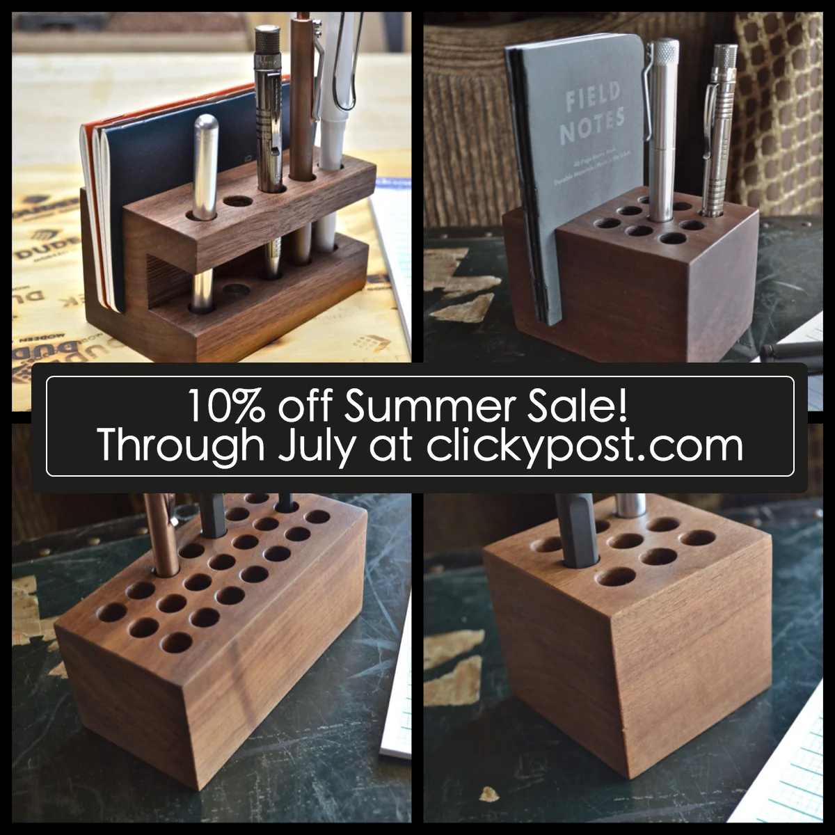
Just wanted to do one last post reminding everyone that today, July 31st, is the last day to order one of my Dudek Modern Goods pen holders with the July 10% off promo before I take a break from the shop in August.

The support has been tremendous!  Thank you! 

Orders placed today will still be fulfilled on into early to mid August, but new orders will resume in September when I reopen the shop.

- Mike

Tactile Turn Mover and Shaker Pens - Part II - New Materials

Mr. Will Hodges of Tactile Turn is again making a splash in the world of machined pens with his newest line of Mover and Shaker pens which debuted on Kickstarter this last week.  Many people are probably familiar with his previous successful campaign consisting of all aluminum barrels, but the new offerings of brass, copper, bronze, and titanium are bound to be show stoppers.

Will was kind enough to send me some samples of the new runs and I'm completely thrilled with how these turned out (pun?).  He sent me the following: Movers in bronze and brass, and Shakers in brass and titanium.  I have to admit, I get the names mixed up most of the time but, to clarify, the Mover is the longer version which takes the G2 and the Shaker is the shorter that takes Parker style or Space Pen refills.

If you own or are familiar with the previous run, you will understand why there is hype around these pens.  The machined surface is smooth, clean, and the break points are nearly invisible.  "Seamless" is what everyone says and it is true.

I was probably most excited about the bronze version as I don't have (nor have seen) any pens made of this material so it is a first for me.  The bronze finish is close (very close) to the brass in color and appearance although having a more reddish hue, but from my understanding it will not tarnish as much or as easily which for many people will be a good thing.  

The raw brass tends to show the very first fingerprints as it comes in contact with our oily fingers and overtime becomes dark with patina, but the bronze will maintain more of its luster for longer.

The brass and bronze versions are hefty, but feel great.  As I've mentioned about other heavier pens, this may not be for everyone as long writing sessions could be tiresome and carrying one in a shirt pocket could weigh you down a bit.  Outside of those concerns, they are fantastic.

The titanium version is pretty slick and looks similar to its aluminum predecessor, but with a richer, darker grey finish.  It looks and feels awesome as one would expect.  It weighs in just under an ounce more than the aluminum version, but is a great weight that fits snugly in between not too light or not too heavy.  I may have to spring for the Mover in titanium...  C'mon?  Who doesn't like titanium?

Aluminum on the left, Titanium on the right

One of the distinguishing features of Will's pens is the long spiraled groove he machines into the grip or, in some instances, along the length of the entire pen like the "Z".  (This is the one in the pictures that looks different...previous review here)  

Head over and check out Will's new Kickstarter campaign to peruse his wares.  A big thank you to Mr. Hodges for sending me over these samples to try!  He is a top notch guy that is passionate about making really great stuff.